Saturday, January 15, 2011

Calender Construction Of Month April 2010

My Next Calendar Is For The Month Of April 2010.

Step 1,
Start with opening a new Photoshop file. I used A4 size file.


Step 2,
Then I placed the picture that I would like to edit. I used a picture of The Great Wall Of China. I named the layer as Wall Pic Original.


Step 3
I duplicate the same picture to keep the original and to edit the duplicate picture. I named the layer as Wall Pic Original Manipulation.


Step 4
I select the picture and changed it into black and white by going to Image -> Adjustments -> Black & White.  Then I arrange the Great Wall Of China picture into a folder and I named it Background.


Step 5
Now I have the basics to work with. I will create some smoke on top of one of the bunker, so I created a new layer on top of the picture and download some smoke brushes.
I placed all the smoke effect accordingly and placed the entire smoke layer into smoke effect folder.


Step 6
Now I need to add some glowing lines along the stair way. I used the Pen Tool “P” to create some smooth lines.
I created 2 lines and added an Outer Glow to it using blending option. Then remove the parts that go behind the wall using the Eraser Tool “E”.


Step 7
All i need to do now is give this some more color.
I added some new layers and used a big soft Brush to add some colors using the Brush Tool “B”.
I created a new layer for every color dot, so i could move them around if I am not happy with the position of the colors. I used the colors Blue, Green, Red, Yellow and Purple and Orange. I Set the color layers mode to Overlay and set the Opacity to 50%.


Step 8
I was not happy about the outcome from step 8, so I closed the black and white layer to use the original picture as my final back ground.


Step 9
I added a square shape and added pink filling and reduced the opacity to 67%. Then, I brought in a vector image from prepared Adobe Illustrator month template to add up the dates and days for the month table. Named the month April with Trajan Pro font and 59 font size and gave it a outer glow by using the blending option.
I arranged the table layer into a folder and named it month table.

Step 10
To finalize my work in added a picture of me which I captured during our group photo shoot for our calendar.  I placed the picture behind the smoke effect to show like the smoke is in front of the picture.


Step 11

By using the Masking, I erased all the access background for my picture and gave it an outer glow effect.


Final Out Come


Friday, January 14, 2011

Calender Construction Of Month March 2010

I decided to make The Leaning tower Of Pisa as my calender concept.


Step 1
Start with opening a new photoshop file. I used A4 size file. I named the layer as blank background.


Step 2,
Then I placed a picture as a permanent back ground and named it as desert texture. I am not going to edit this layer. I used a picture of The Grand Canyon. I placed both the blank and desert texture into background folder.

Step 3,
Then I placed a picture of Leaning Tower Of Pisa and named it Pisa Photo Original Photo. Then, duplicate the same layer and named it Pisa Photo For Manipulation. This layer of photo is to retouch it. I hide the original photo.


Step 4
By using the masking technique, I used brush tool to mask the Pisa photo to make it look like the structure is build out of the rocks. After masking, I used blur tool to blur the edges of both the structure and also used the Clone Stamp Tool clone the bottom part of the Pisa tower and also the side part of the palace to give a effect of like it is sculpted out of the rock.
After that, I went to Image – Adjustment – Exposure and reduced the gamma correction and exposure to give a darker effect.
Then, I went to Image – Adjustment – Variation to adjust the colour effect. I gave a brown colour to match the texture background.


Step 5
Then, I placed a statue picture on a new layer to edit it. The statue has a history to do with the Pisa Tower.
I used the masking technique to crop the statue and place it on the rock like it is on the rock naturally. Then, i went to Image – Adjustment – Variation to give the statue a brown colour effect.


Step 6
I added a square shape and added pink filling and reduced the opacity to 67%. Then, I brought in a vector image from prepared Adobe Illustrator month template to add up the dates and days for the month table. Named the month March with Trajan Pro font and 59 font size and gave it a outer glow by using the blending option.
I arranged the table layer into a folder and named it month table.


Step 7
To finalize my work in added a picture of me which I captured during our group photo shoot for our calendar.  I placed the picture on the month table.


Step 8
By using the Masking, I erased all the access background for my picture making me look like i am resting on the month table.


Final Out Come


Calendar Assignment Intro

For My Last Assignment, we were suppose to construct a calender. We had to form a ground of 6 and each of the member has to come up with 2 Months calender. We named our group as KedaiGambar.

Each of the person has to chose 2 month and I got March and April.Then we decided to construct year 2010 calender. The theme of the calender was Wonders Of The World Photo Manipulation.

I decided to use the Leaning Tower Of Pisa and Great Wall Of China for my photo manipulation concept.

Monday, December 6, 2010

My Extra Work

This are my out of class photoshop usage.

I designed a banner for the MMU Hostel Committee.
First Design

Second and Chosen Design


Design for Sports Carnival organized by Hostel Committee


Design for my girlfriends Birthday Wishes 


Just a normal color and brush effect. 

In Class Exercise – Photo Correction

In out computer graphic tutorial class, we were ask to do a photo 5 step photo correction. The outcome is as bellow.


Actual Photo


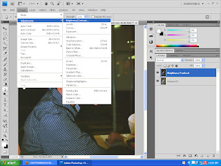
1st step – Adjusting Brightness and Contrast


 2nd step – Blur Tool For Facial Effects


3rd step – Brush Tool for special effects


4th step – Color My Hair


5th step – Tattoo


Side By Side Comparison

The End Of Photo Correction

La Tomatina Wallpaper

 Hi, after sometime I decided to upload my wallpaper. It took quite some time because I was trying to get a right music to play along with my wallpaper in my blog. So, my wallpaper is as bellow.

 FINAL WALLPAPER

This was my final outcome of my wallpaper. The reason why I chose Tomato festival is because, I always wanted to join the celebration. La tomatina has always inspired me. There are many common celebration we know around the world but La Tomatina is something very interesting, dirty and extremely fun.

This below picture was my earlier design which I changed to the latest one(as above). I didn’t not like it but I still decided to upload to show that I made some minor changes in my first changing it to my final wallpaper(as above).